A Look At Olympic Logos
LONDON, UK -- Hosting the Olympic games is an honor for any city in addition to a potentially large revenue boost, but it is also an expensive event with complicated logistics. It is no surprise then that one major component of every Olympics is marketing, and, specifically, the creation and use of the Olympic emblems or logo.
Though we often think of the 5 colorful, interlocked rings (as seen in Photo 1) as the symbol of the Olympics, this logo was only introduced starting in the early 1900s, with the 5 interlocked rings representing the 5 inhabited continents of the world. It has been used ever since, but is not always colored. Additionally, it is often paired with other elements unique to that year’s Games. As one of the most recognizable logos in the world, the Olympic rings are an important part of the marketing efforts surrounding the Games.
It is for this reason that the individualized logos created by the host city come under a lot of scrutiny. These logos are created and proposed by one of the committees of the host city, either the Organizing Committee of the Olympic Games or the National Olympic Committee, and must adhere to certain guidelines. The International Olympic Committee is responsible for approving proposed logos to be used in promotional materials as well as on the uniforms of the competitors in that year’s Games.
London’s 2012 Olympic logo - a bright, jagged representation of the number 2012 - has received a lot of negative publicity since its unveiling. Available in 4 official colors – pink, orange, blue, and green – it has a very modern look. Many feel that the logo does not adequately represent the Games, nor does it offer a unique nod to London itself. The challenge of creating a great Olympic logo lies in upholding the traditions of the past and adhering to the Olympic Committee regulations while simultaneously presenting something unique about the host country. The latter is often accomplished by including a famous landmark, a particular style of art, or colors specific to the host country. Some designers feel that the host country should be identifiable simply by the logo. Many feel that London’s logo does none of these things. Nevertheless, the logo was approved by the International Olympic Committee and will be used for the duration of the Games, set to start at the end of July.
While support for the logo has been less vocal, it is also there, with some feeling that the bright logo is energetic and will become a source of pride for the country. London has stated that the new logo is designed to be more accessible to younger generations, engaging them in the Olympics and reaching out to that age group.
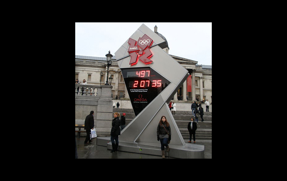
The logo can also be seen on the official ‘countdown clock’ (as seen in Photo 2) located in London’s famous Trafalgar Square.
Photo credits
Photo 1: Public domain, from Wikimedia
Photo 2: © amandabhslater from Flickr and used under Creative Commons License


