Thalotober Artist Series: Dave Mahan
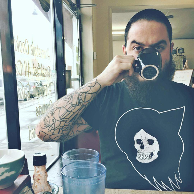
Inktober 2020! Here we are again! I have participated in Inktober for the last few years (I think 2014 was my first year). It is usually a great way for me to decompress in between freelance illustration jobs, try new techniques in a very low pressure environment, and sometimes work out ideas that I will turn into full illustrations later on. I look forward to Inktober every year, but this year I was especially psyched. I’ve been working digitally in Procreate for most of the year and haven’t had much of a chance to work with traditional media. My favorite brushes were caked in dust and my desk was strangely lacking any piles of sketches and other clutter. I was thrilled to have an excuse to work traditionally again. I was especially excited to with my favorite medium: ink and brush.
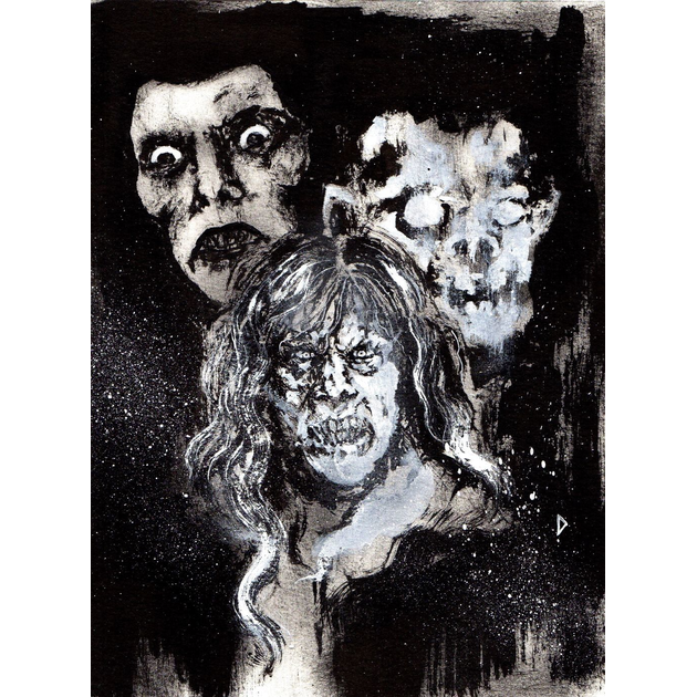
Ink and brush has been central to my work for years. It lends a certain spontaneity to my mark making and keeps things from getting too stiff. When you work in ink and brush your marks tend to flatten out and create an interesting graphic shape. You can always add dry brushing to include some variation in value, but it will still contribute to a flat graphic shape where marks all blend with one another. To me it is reminiscent of comics, old movie posters (especially Saul Bass), and band shirts. Now... what do you do if you don’t want things to be as flat? My usual answer is white ink.
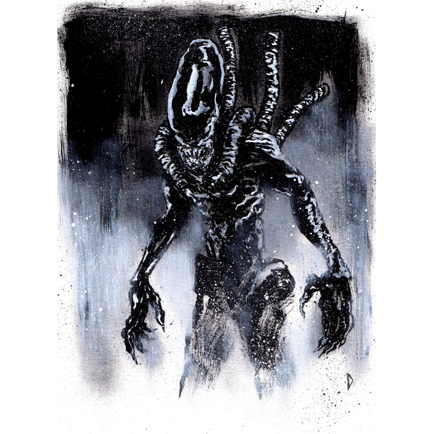
I think white ink usually gets forgotten simply as a way to correct errors. To me white ink is so much more. It allows the white space in an ink drawing to be more expressive than a the white of the page since different techniques can be applied. I will often use dry brushing with white ink to push some black marks back in space. It takes on an airbrush like quality adding a sort of atmospheric fog. Other times i will use splatter to achieve a similar effect. On the other hand, when I want to keep things looking flat I will use shapes made of white ink to draw in the negative space. This way I can have the white shapes make their own marks white retaining a blocky, almost photocopied look.
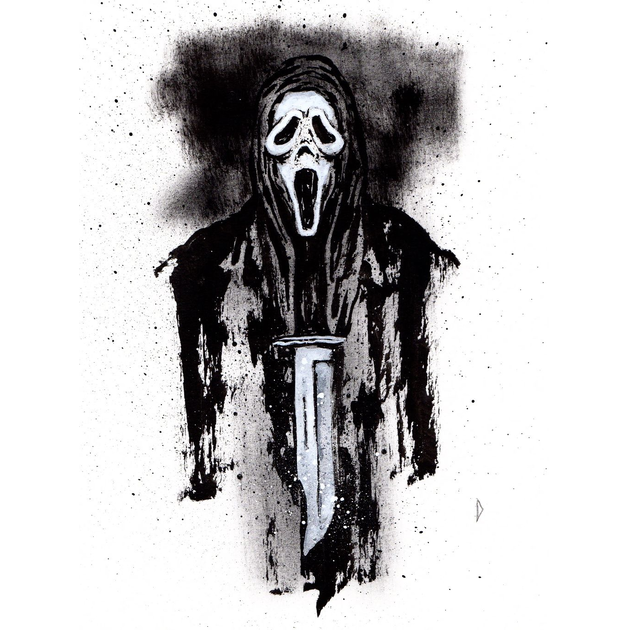
I hope that if you are working on an Inktober challenge, gathering ideas in a sketchbook, or planning a finished illustration for a client you will remember the magic of white ink. It’s useful for more than fixing errors, and it might open up some new pathways in your artistic journey!
